An entropy criterion for visualization
Just throwing up a half-baked idea here. I can’t even confidently assert novelty since I still haven’t worked through relevant background like this.
In the running visualization 2-d histogram idea I’ve been playing with, I’ve been setting probably the most important free parameter arbitrarily. The (linear) grid size \(n\) determines how coarse or fine the binning is, with the total number of bins being roughly \(n^2\).1 From unsystematic exploration, a grid size of 3 is too coarse, a grid size of 200 is too fine, and a grid size appeared adequate enough to stop searching further.
There’s a philosophical, or at least methodological concern, that I need to address before moving on. If I’m asking “what grid size is best?”, I might really be asking or instead should be asking “what grid size is best for this particular task?”. Further, this task should have a concrete answer that is known to me, because otherwise how can I assess if the visualization is effective at helping a user complete this task?
I can sidestep this concern in two ways. For the first, I can ignore any pragmatic use of the visualization and just be concerned with aesthetics. A figure that looks nice or interesting is ceteris paribus2 to be treated as better than one that looks ugly or boring. For the second, the visualization can be treated as loss data reduction, with the amount of loss scaling with the coarseness of the grid. Task-specific visualizations can be approximated as operations on the reduced data. A data reduction that incurs low error for a range of tasks can then be treated as good without reference to any particular task.
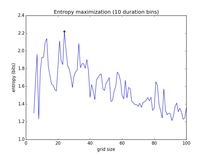
The criterion for grid size I’m fiddling with is based on maximizing entropy. In particular, for a range of grid sizes, a 2-d histogram is produced. Each region with at least one observation has a value giving the number of seconds I spent running in that region. Equivalently, this can be interpreted as color from white to blue. Ignoring the spatial structure, this can just be treated as a distribution over durations or colors. Because there is a limited capability to discriminate between similar colors (especially when they’re alpha-blended with the map), I bin the range of these values down to 10 categories. The entropy of this distribution is the quantity I seek to maximize.
It can be informally argued that in a 2-d histogram with high entropy as defined here, the region colors are conveying a lot of information about how much time was spent in the various regions.3

For Providence, RI runs through 2015-04-11, the entropy criterion is maximized at \(n = 24\) with an entropy of 2.22 bits.
The choice of the number of duration bins itself has an effect on the outcome, and so must be chosen carefully. However, this choice may be made on the basis of the legibility of the color scale and without any direct reference to the running map.

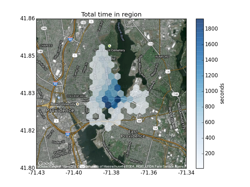
Visualization of Providence, RI runs through 2015-04-11 at the algorithmically chosen \(n = 24\) binning.
Although the visualization at the grid size picked by this criterion doesn’t look strikingly optimal, it does at least look reasonable.
It would be conventional to state some open questions and ideas for future tests here, but so much about this idea is unsettled that pretty much any reasonable direction to go in appears open.
The “roughly” is due to details of exactly how hexbin packs a square region with hexagons.↩
Other things held constant, a foundational concept in causal inference.↩
On the other hand, this procedure ignores information about which areas of the map were ever visited versus those that were not. Attempts to incorporate this led to less compelling visualization, and have been put aside for now.↩