Finishing the map
Art isn’t easy.
Every minor detail
Is a major decision,
Have to keep things in scale,
Have to hold to your vision–1
I made a few changes to the running visualization I put up a few days ago.
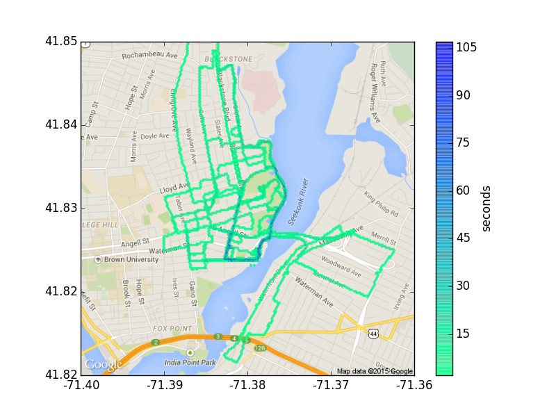
The scaling of the map background was not quite right, due to the geometry of the Earth2 and weirdness in matplotlib’s imshow function3. It wasn’t particularly easy to notice this for runs in Worcester, but in my Providence runs, it was hard to ignore that I was running through Seekonk River. This has been fixed.

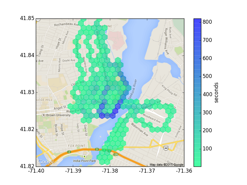
Providence, RI runs. Binning to 200×200 hexes.
There was also some anisotropy in the hexagons that I removed to make the output look a lot nicer.

Providence, RI runs. Binning to 28×28 hexes.
Anyways, the whole point of diving back into the code was to get movie output working, to make it possible to visually interpolate between the linear and histogram views.
Providence, RI runs. Going from a grid size of 200×200 to one of about 3×3.
It’s the nature of the beast that this took less time to implement than either of the scaling fixes.
Excerpt from “Putting It Together” in Stephen Sondheim’s Sunday in the Park with George.↩
This should have been clear to me just from a few seconds of actual thought. The map of GPS locations has equal aspect ratio in terms of angle (degrees latitude and degrees longitude). The map that Google spits out has equal aspect ratio in terms of distance (meters latitude and meters longitude). Given how cylindrical projections work, moving the same distance (in meters) north or south requires less of a change in degrees latitude than moving that same distance (in meters) west or east does in degrees longitude. Figuring out exactly what the ratio is requires a bit of trigonometry (spoiler: it’s the secant of the latitude given in radians). Since these visualizations take place over relatively small regions, we can just use the same ratio over the region with little error.↩
imshowisn’t designed to display images at 1-1 scale, so it’s tricky to find the coordinate system on the map so that the histogram can be overlaid. A hacky solution (that works!) is to use exactly the right map image size so thatimshowhappens to give the right scale.↩