Lif lessons
For background, see my earlier post I want more Life.
I ran into a nice instance of serendipity while mucking around in the code for my Game of Life variant.
The exact dynamics of Lif are completely irrelevant here. Just think about a grid of sites, where each one is just big enough to hold an individual (or a family or a population or a city or…). A site may be alive, in which case it has a phenotype that specifies the neighborhoods in which it can continue to remain alive. Alive sites also have a lineage, which they inherit from the alive site that settled them. Alternatively, a site may be empty. Empty sites start inhospitable and become less so over time, and new lineages may arise when an empty site becomes hospitable enough without having any neighbors to settle it. Each synchronous step of the dynamics is called a generation.

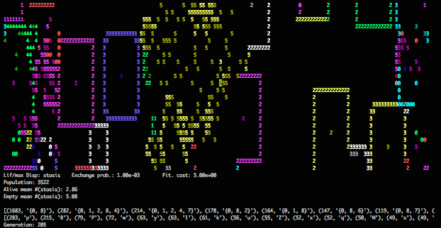
Normal visual output.
This is a typical snapshot from a simulation of Lif dynamics. Sites are colored by lineage and numbered by the “complexity” of their phenotype. Lineages with simple phenotypes hold territory by sending out waves of settlement. Those with more complicated phenotypes can continually occupy some sites while being well-positioned to resettle their hinterlands.
Profiling revealed that a lot of execution time was spent on blanking out sites after their deaths. On a lark, I removed this blanking step, expecting to see something of mostly aesthetic interest.

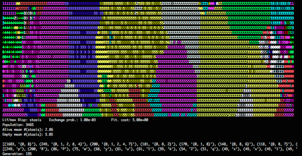
Visual output without erasing sites after death.
Instead, I got a visualization that was immensely clarifying. By not blanking sites on death, I essentially get a map of sites painted by the most recent lineage to have settled (or arisen) there. The waves and pulses of the simple lineages become solid regions. The speckle of complicated lineages also resolve to regions (with higher intensity coloring indicating recent settlement).
Events in normal visualization play out at the scale of single generations while events in the new visualization play out over tens or hundreds of generations.

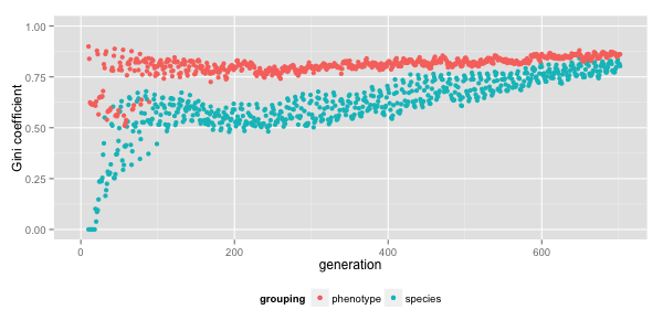
Plot of inequality (as quantified by Gini coefficient) across phenotypes and lineages by generation in a typical run of Lif.
Since this is also the time scale of interesting quantitative trends in these simulations, I’m interested in what the new visualization has to show.
On a more abstract level, I think this is a telling illustration of profiling code in a non-performant language. Whatever I do, my loop-centric code is going to be roughly 100× slower than code in a performant language. But profiling in Python to find a 2× speed-up before translation may be more pleasant than working out the isomorphic speed-up in C. And, as demonstrated above, performance concerns may be a productive source of inspiration and insight.