Bootstrap
Tags: meta
At my pal Steve Gomez’s urging, I decided to experiment with using Bootstrap on this site. Bootstrap decribes itself as “the most popular HTML, CSS, and JS framework for developing responsive, mobile first projects on the web”.
The responsive design aspect is currently of importance as Google had announced that “Starting April 21, we will be expanding our use of mobile-friendliness as a ranking signal”. Although the site already passed Google’s automated Mobile-Friendly Test, the actual appearance wasn’t great.

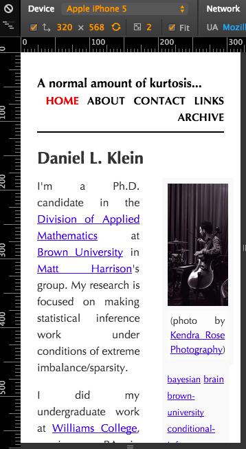
The home page of this website before Bootstrap, as it might appear on an iPhone 5, as imagined by Chrome’s Developer Tools.
The most pressing problem is the navigation bar that consumes the top third of the page, and that also looks sloppy when crowded into a narrow space. This was the primary issue I addressed with Bootstrap.
To get an idea of the issues involved with integrating Bootstrap with the Hakyll static site generator, I took a look at Stephen Diehl’s hakyll-bootstrap project. Although I found a lot of useful ideas there for making my main hakyll function less terrible, I didn’t find much there of immediate use. Much more helpful was the blog example on the Bootstrap getting started page.

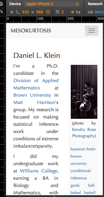
The home page of this website after incorporating some Bootstrap features, as it might appear on an iPhone 5, as imagined by Chrome’s Developer Tools.
The button on the top right of the screen, blazoned with three stacked horizontal lines,1 can be triggered to expand into the full navigation bar.
The next issue to attack is making the sidebar disappear, or at least go somewhere else, so that it doesn’t crowd the body text into a narrow strip. The solution to this will probably involve diving into the grid system for specifying (or maybe hinting at) a layout.