Time is a circle (2/4)
This is the sequel to a post that was originally numbered “(1/2)”. The scope of the problem has expanded slightly since then. Additionally, the recent GHC 7.10 release has trickled down into the homebrew formula, which I installed without realizing that it would break hakyll. Trying to fix this has been a distraction.
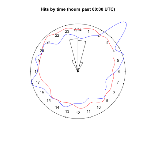
So with minimal explanation, here is the figure that is now generated at the end of my website analytics task using an unholy combination of rpy2 and R’s circular package:

Visualization of (non-bot) website activity by time of day, showing data up to 2015-04-07.
The blue loop is the (smoothed) data, roughly 1000 times mapped onto the same 24-hour analog dial representation of the day. The red loop is the same smoothing of points sampled from the von Mises distribution fit to this data using MLE. The wedges are a representation of the 95% bootstrap confidence interval for the location paramater of this distribution.
In the next post, I’ll explain what all of this means, both for the data and for the distribution being an adequate model for the data. In the post after that, I’ll investigate a richer class of mixture models that can capture more of the observed features of the data.